One of the greatest ways digital has impacted the
scrapbooking world in the past few years, is through the introduction of
electronic cutting systems such as the Silhouette.
Cutting files are becoming more and more popular with
wholesale brands. Many have started adding a digital section to their
stores. Their intent is not to replace
their printed market, but to enhance it with add-ons like titles, ephemera, and
masks. These files are typically under
$3 and really give you some flexibility with your paper craft projects.
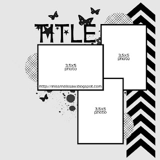
Today's layout was based on a sketch that I borrowed from my friend and fellow Artsy Addicts Member, Melissa Williams, at http://www.simplesketches.blogspot.com.
I had one really dramatic action shot that I took last May of my Nephew, Derek, that I've been dying to use. I wanted it to be the central focal point of the layout. When I reduced the size to 3.5 x 5 I lost the impact of the shot. I decided modify my layout a bit from the sketch and just go with a 5x7 photo. Which brings me to a side note - make sketches your own. Use them as a starting point, but don't be afraid to add your own details, and preferences. It is your layout after all!
For our digi lesson today, I wanted to show how you can use your electronic layouts to build embellishments for your projects. These cutters are not just for titles! With the exception of the cardstock, paint and star buttons everything was cut from my Silhouette.
The sketch had a cheveron pattern in the right margin, and I thought this would be a great opportunity to use my Silhouette. I cut the cheverons from the base cardstock. I used soccer balls to represent the circles in the sketch. Instead of paint splatters, I used a Heidi Swapp's star confetti stencil with some metalic silver paint. I then substituted reflective star buttons for the butterflies in the sketch. I used the font JennaSue to cut out my title. :::Another side note - all the embellishments were cut from scraps - another bonus!:::
To give the layout a "star" shine I decided to go with metalic accents. I painted the title with silver distress paint to give it a foil texture. I added silver metal cardstock to the back of the cheveron's negative space, and added the same metalic cardstock to the base of the soccer ball cuts. The flag on the photo is also from the Silhouette store. I love how it points to the action in the photo, and serves as a tab for what is underneath....
 |
| hidden photos and journaling |
I decided to make the photo lift to include the team photo and individual shot of my nephew. The dramatic reds took away from my action shot, so hiding them underneath, allowed me to use them without distractions.
This is probably one of the "simpiliest" layouts that I have created. Although it is simple, it has a lot of dramatic elements with the mirrored cardstock. The monochromatic color scheme and simple design really make my photo take center stage. Sometimes the simpiliest designs are the hardest to walk away from - but the most rewarding in the end.
Thank you Melissa for allowing me to use the sketch. I love how everything in the sketch gives you a feeling of upward movement. Much like the movement of the soccer ball flying into the air. For additional sketch ideas, be sure to check out Melissa's blog.
Thanks for stopping in today,
Tonya Gibbs
http://www.psychomomscrapbooks.blogspot.com
http://www.psychomomscrapbooks.blogspot.com
Resources:
Silhouette Cameo
Silhouette Store Cut Files: Soccer Ball, Chevron, Chevron Flag
Heidi Swapp: 6x6 Confetti Mask
Plaid: Metalic Paint
Ranger: Mirror Paper, Distress Paint
Star Buttons
GP - White Cardstock
Geli Roll: White Gel Pen
Font: JennaSue - DAFont.com
Silhouette Store Cut Files: Soccer Ball, Chevron, Chevron Flag
Heidi Swapp: 6x6 Confetti Mask
Plaid: Metalic Paint
Ranger: Mirror Paper, Distress Paint
Star Buttons
GP - White Cardstock
Geli Roll: White Gel Pen
Font: JennaSue - DAFont.com


You did such an awesome job with my sketch! It's always a pleasure to see your take!
ReplyDelete